
Personal Connections.
Powerful Solutions.
A design system for a 100-year-old community bank. Approachable, confident, and rooted in the towns it serves.
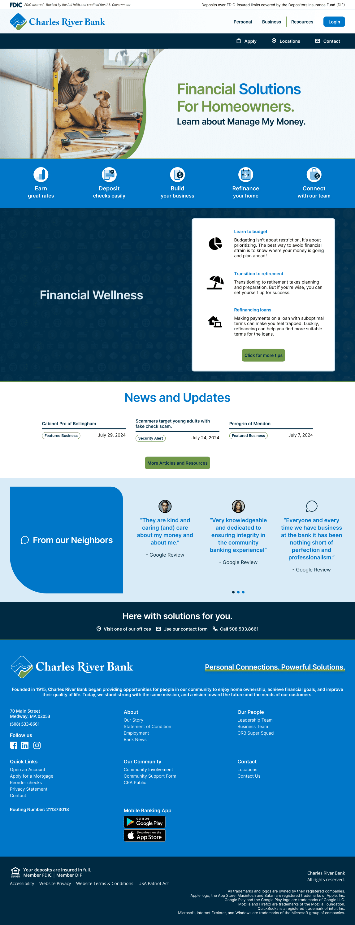
Desktop · 1440px

Mobile · 390px
Scroll inside either device to explore · Views are synced
This guide represents the design direction I developed and presented for Charles River Bank while art directing at Sundin Marketing. What follows is a walkthrough of my design thinking and process.
Design Principles
Charles River Bank has been around since 1915. The design system needed to feel that way: personal, not corporate. Trustworthy without being stiff. Modern enough for digital banking, familiar enough for the people walking into the Medway branch.
Neighbor, Not Institution
The site should feel like talking to someone who knows your name. Warm, direct, helpful. If it reads like a corporate brochure, it's wrong.
Earned Trust
When you've been open for over a century, you don't need to shout. Blue and green signal stability and growth. The design stays restrained so the content can do the work.
Action-First Navigation
Pages are organized around what someone wants to do, not how the bank categorizes its products. The mega menu and quick-links bar lead with tasks, not taxonomy.
Rooted in Place
The photography, the language, and the tone all point back to Medway, Bellingham, and Mendon. This isn't a generically “friendly” brand. It's specific to the communities it actually serves.
Brand Palette
Blue carries the weight: headlines, buttons, links, and the quick-links bar. Green shows up in the logo mark and as a highlight color in hero headlines. Navy grounds the mega menu, footer, and select CTAs. A light blue callout softens sections that need contrast without heaviness.
Color in Context
Hero headlines use a two-tone treatment. One word or phrase renders in green while the rest stays blue. The green word isn't always the first word. It's the word that matters most on that page, chosen to build character and draw attention to what that section is really about.
Type System
Inter Semibold for headlines. Helvetica for everything else. The font choices are deliberately simple. A community bank needs to be legible and trustworthy first. Typographic personality comes from the color treatment and the hierarchy, not the typeface itself.
for Homeowners
Key word in Green (#719949), the rest in Blue (#0071BD).
Charles River Bank is dedicated to fostering financial success for individuals, families, small businesses, and supporting the communities we serve. As an independent co-operative bank, we strive to be the best locally managed bank in our community.
Logo System
The mark pairs a green and blue mountain-and-river icon with the wordmark. It appears in three contexts across the site, plus a separate Wealth Management lock-up for advisory pages.


UI Patterns
The same patterns repeat across the site: intent-driven navigation, clear CTAs, and the quick-links bar that anchors the homepage below the hero.
Buttons
InteractivePrimary CTAs use solid blue. Login uses a pill shape. Green reserved for high-intent conversion points.
Hero Section
Page-Level
Split layout with lifestyle photo on the left and content on the right. The photo uses a curved mask with a green stroke that pays homage to a wave element from prior brand materials. Two-tone headline treatment. Single CTA below the subhead.
Quick-Links Bar
Navigation
Primary blue bar with custom-designed iconography in white circular containers. Each link pairs an action verb with a short description: Track, Access, Move, Shop, Deposit. Icons were designed to be distinct at small sizes while staying consistent in weight and style.
Global Navigation
Global
Three tiers: white FDIC compliance bar at top, a light blue to white gradient header with logo and primary nav plus pill-shaped Login button, then a navy utility bar with Apply, Locations, and Contact. Clean separation between regulatory, brand, and action layers.
Photography Direction
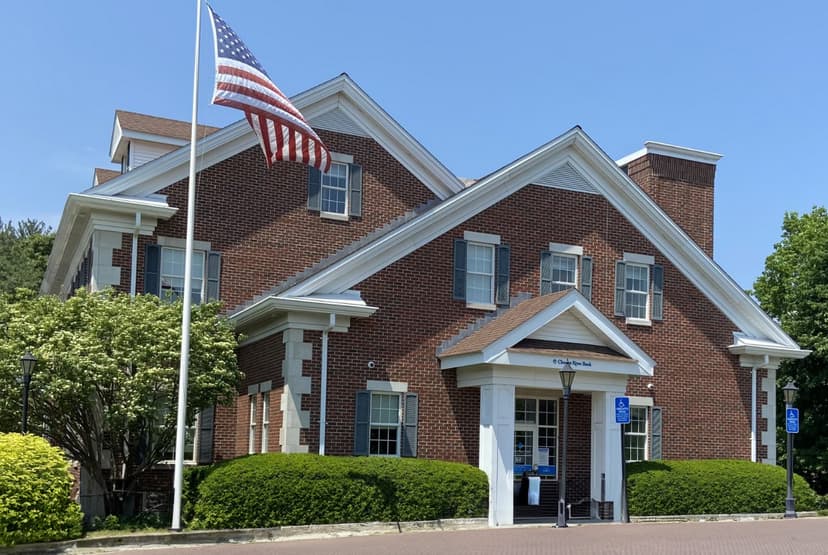
Warm, lifestyle-focused photography. Homeowners, families, real places. The subjects look like people who actually bank here, not stock photo actors. Product page heroes use a signature curved mask on the left edge that softens the image into the content area.
Curved Photo Mask
Art Direction
Every product page hero uses this curved mask. The left edge of the photo has a smooth, organic curve that transitions into the white content area. It keeps the layout from feeling boxy and adds a sense of warmth that fits the community positioning.





Optimizing the Image Pipeline
This project involved 40+ images across hero sections, product pages, and promotional cards. Each one needed to work across multiple formats and dimensions. Generative fill and expand were used to adjust imagery as needed for different scale contexts, keeping hero shots intact across web, social, email, and print placements. That alone cut multi-format production time roughly in half.
AI-generated moodboards also sped up the concepting phase. Instead of the team filtering through stock libraries without a clear target, generated reference images gave everyone a visual starting point before the search began. For a site needing 40-60 curated images, that made the curation process significantly faster.
The last bottleneck was delivery. Best practice called for webP format for web images, but there was no good way to batch-convert that volume natively. I created a custom Photoshop script with AI that automated the entire conversion: open a folder, export everything as webP. What used to be tedious manual work became a 15-minute execution. Each of these optimizations started the same way: hitting a wall and thinking there has to be a better way to do this.
Asset Generation & Production Pipeline
Not everything on the site came from a stock library. Some assets were generated from scratch to fill gaps where photography couldn't. The Financial Wellness background is a good example of how AI-assisted production and custom workflow tooling kept things moving without ballooning the budget or timeline.
Financial Wellness Background
Generated Asset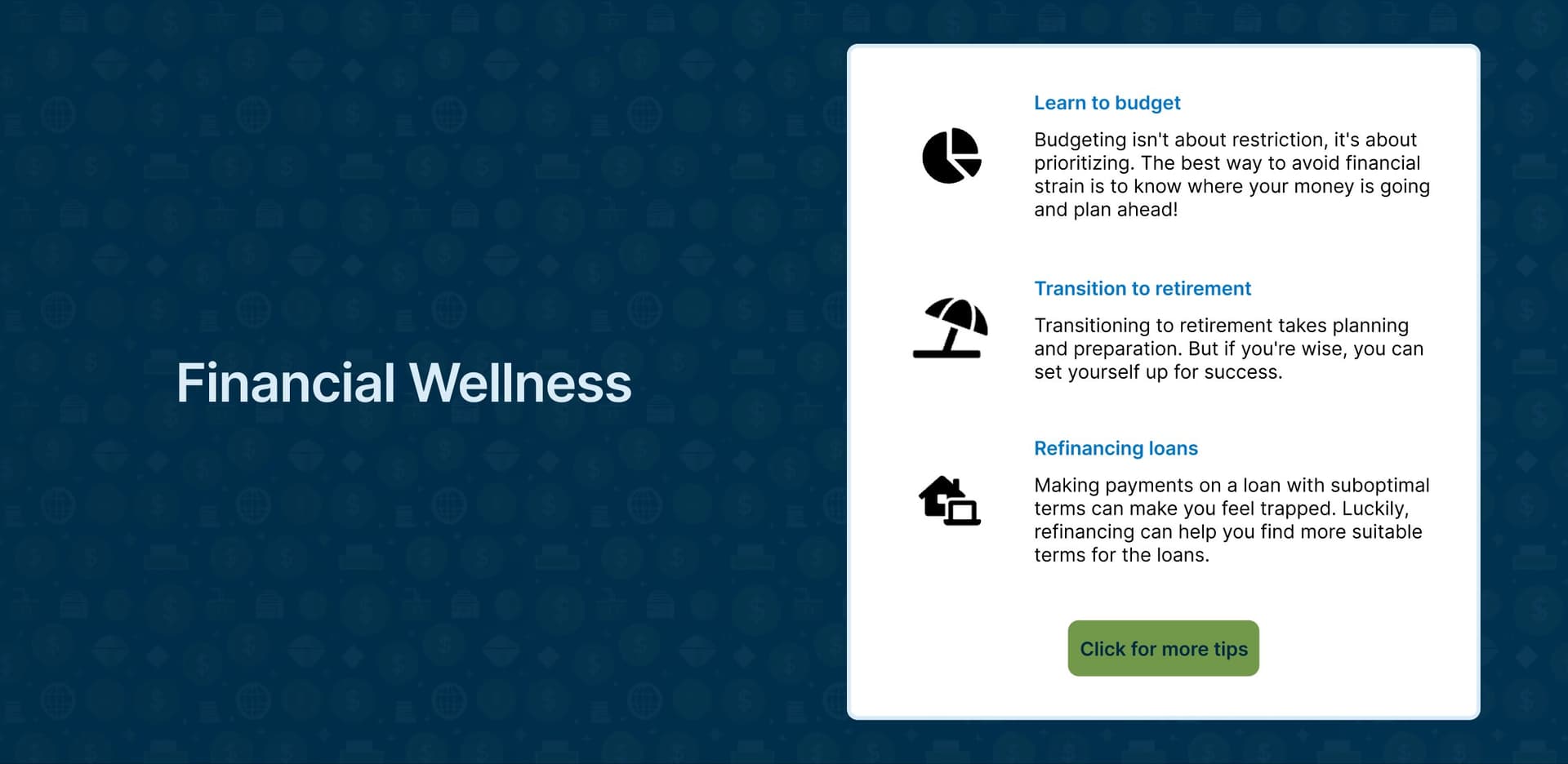
The Story Behind This Section
The homepage needed a Financial Wellness content block that felt visually distinct from the rest of the page but still on-brand. Stock photography didn't fit the tone. Instead, a custom icon-pattern background was generated using the bank's existing iconography set, tinted to the navy palette with a subtle repeating grid. The result is a section that feels purposeful and polished without requiring a photoshoot or outside illustration work.
Voice & Tone
The bank talks like a knowledgeable neighbor. Approachable but not casual. Confident but not pushy. Copy leans on second person and action verbs.
Warm
“For our neighbors.” The copy frames the bank as a community member, not a service provider. That's the through-line on every page.
Direct
Headlines use imperative verbs: Earn, Deposit, Build, Refinance, Connect. No filler. Every word earns its spot.
Empowering
“Solutions for you.” The bank enables. The customer achieves. The positioning always shifts expertise toward the person reading.
Grounded
Founded in 1915. Three branches. Real addresses. Named team members. Specificity is what builds credibility here.